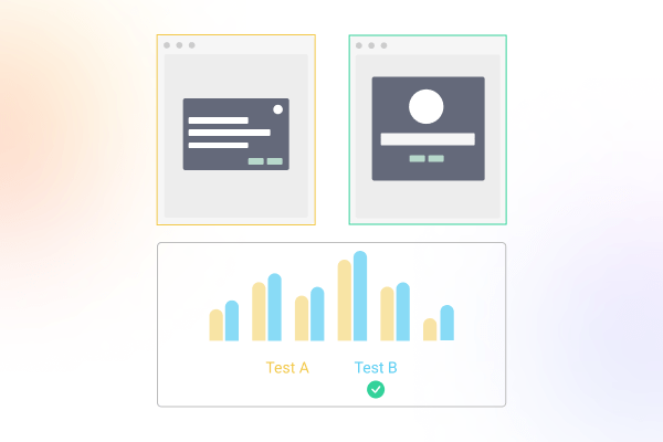
From the days we have started documenting how businesses work; entrepreneurs and students have been looking into how one can improve their bottom line revenue. Customer experience, conversions have been music to ears of everyone interested. Hundreds of case studies and literature written on how a waiter offering spearmint after the bill has raised tips, and how after offering another it was increased by additional n%. All this reciprocity to get net more $ out of customers pocket.
For the sake of this conversation, we’ll consider user experience as an extension of customer experience (or vice versa?) and how user experience ties to conversion rate optimization in times when a good portion of transactions are done over screens.
Defining conversion.
Before digging in we should identify what’s your definition for conversion.
For an eCommerce store, it would be a percentage of visitors turning into customers. We can also zoom in and observe the conversion from “Add to Cart” to “Go to Checkout” to “Checkout”. The number of ‘steps’ it took the visitor from landing on the page to taking each subsequent step will also have its own conversion. For ex. Number of Abandoned Carts, etc. We will go into the details on this later.
For a B2B SaaS Website, the conversion can be the percentage of users signing up to your ‘conversion goal’. Conversion goal can be defined as primary action the website is optimizing for; Sign ups, Free Trials, Demo Registrations, Subscription, are the most common CTAs for a B2B website.
The 1% Impact.
Let’s assume a landing page converts 1.5% of traffic totaling $130,000.00 in ARR. What happens when you improve the conversion from 1.5% to 2.4% (a ‘mere’ 0.9% increase in total conversion %). The ARR jumps from 130k to 208k! 60% increase in revenue and overall conversion rate.
What is a good conversion rate? and How to increase it.
A quick google search citing ‘conventional wisdom’ explains rather confidently that a 2 to 5% is a ‘average performance bucket’. If I sell an Island off of the Pacific Ocean and target 100,000 visitors via ads (targeting 16-year-olds via TikTok), that would mean I have 2000-5000 teenage buyers and islands to create out of thin air.
A good conversion rate depends on the industry you’re in, people you’re targeting for your campaign, your market’s buying power, and a bunch of other factors.
Luckily, there are some universal principles that can work with most if not all campaigns to increase your conversion rate with tweaking your landing page/funnel’s user experience.
We will go over each briefly, in no particular order.
Know who your ideal users/customers are.
Are the potential customers for my island 16 year olds or ultra high net-worth individuals?
Educate user about the product.
What value are you providing? Address the problems and the solution your product handles for your ideal customer profile.
What questions can they have for X Service before making the decision?
Address those on your landing page and any objections they may have.
Are there questions that you regularly get asked in your inbox? Another good place to start would be to look into your competitors campaigns and what objections and value they are communicating.
Performance
Performance across all devices. 2 seconds load time is great loading speed and ensures your users don’t churn out while the page loads.
Trust and Social Proof.
Highlight testimonials and build trust with your visitors by sharing reviews and social proof.
The 5th grader test.
Keep things simple and clear. Read out your copy to a 5th grader, does he understand what you do? Great! Don’t have a 5th grader to test? Try writing tools like Hemingway which reviews and rates the readability of your copy.
Make sure your campaigns are responsive on mobile and desktop.
Majority of websites fail to optimize their website and landing pages for mobile which results in leaving money on the table.
Make it easy (and accessible) to make their decision.
Ideally, your CTA should be easily accessible (at all times) for the user to make the conversion as soon as the decision is made.
This process should also be simplified (Click to Conversion in as few steps as possible).
Be human.
A good reminder that there’s a human behind the screens and we like being treated like one. Works wonders over screens and IRL.
The list above can be a good starting point as you work through your landing pages or campaigns or use it as a quick checklist to review your current system. I have leveraged the same list as part of my conversion rate optimization consultations to audit complete experiences for startups and also design new ones from scratch.
I will be covering more and everything I learn about products, conversions, and UX in this space and keep adding everything I learn along the way. If you have any questions or feedback, please drop a line via the contact page.
Valē.


